When I worked at a gas station a few minutes from my house through high school, I was never allowed to sit. Even if I was ringing things up at the cash register, something that could just as easily be done on top of a stool as on my feet, even during the long stretches when we didn’t have any customers, the most respite I could get was to lean on the counter, which was, of course, discouraged.
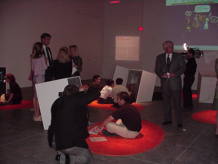
I think there was a single chair in the entire place. And while most museums and galleries aren’t in such a dire state, trying to find a seat has, generally, gotten significantly harder, especially in modern and contemporary art spaces. When they’re provided, usually in front of a video piece so spare and lengthy it’s already enough of a punishment in itself, they’re extremely basic, often backless benches. The museum has its origins in private studies and collections, the studiolo, the wunderkammer, where the private individual enjoying their collection would almost certainly be seated, and further, that historically benches and couches have been provided to encourage lingering and seated contemplation. Exhibitions in this context still had a disciplinary function, but were also seen as providing a positive form of alternative leisure to the uncultivated mass.
A consequence of the increasingly spare white cube model, a model which accelerates the circulation of art objects as interchangeable commodities, has also been that seating in commercial and contemporary gallery spaces has become increasingly minimal (uncomfortable), as to not “interfere” with the work. Reesa Greenberg notes that even when seating reappears, it is often tucked into the hallways or accompanied by texts about the works on display, rather than offering a comfortable and appropriate spot to look at the art. This trend comes alongside the transition, with the rise of modernist attitudes towards the function of art, from experiencing art as pleasure to engaging with art as work, and the good visitor being one that displays appropriate gallery work ethic. Standing to read long texts explicating the work on display and walking around it moves the gallery visit closer to labor, and anything that contributes to the pleasurable reception of something is implicitly marginalized as lowbrow. (Like bringing a bag of cheeseballs to a screening of Stalker, which I definitely did not do…)
Removing seating removes relaxation, physical recuperation, the material reality of a human visitor, from the gallery. And so, the visitor doesn’t stay. What could be an elongated contemplation of a work instead becomes a passing glance as the visitor walks from piece to piece, never stopping long. This has interesting consequences for displaying videogames. Unlike fine art, now connected to ideas of self-cultivation and work to “get it,” videogames are still seen as more straightforward entertainment products. They often valued by how many hours you can sink into them, rather than if anything can be pulled out. And, of course, with the exception of arcade cabinets we generally play them at home, in our rooms, lounging in front of the TV, even in bed, usually alone.
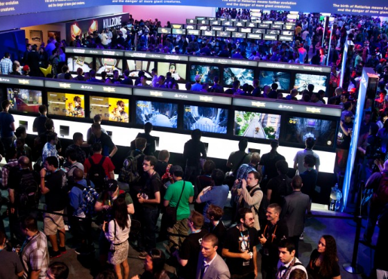
When I started looking a videogame exhibitions, I mainly looked at major traveling exhibitions from the 2010s on. In essence, I was wondering why they all sort of looked like E3, a tradeshow style of exhibition, rather than taking on the exhibition forms used in the rest of the gallery. E3 is the land of the kiosk, where lines and crowds are the norm and taking in a quick demo of upcoming games on your feet is seen as the most efficient way to circulate people through the space. The kiosk is meant to provide a taste and then encourage the player to move on, presumably towards a purchase given how this display method has also cropped up in Wal-Marts and Gamestops.


